Saturday, June 18, 2016

Firestorm Replica Leather Jacket

Ever since Firestorm appeared on Legends Of Tomorrow in an actual costume (as opposed to the look he had on The Flash), I've been waiting for someone to produce a replica costume. They've now started appearing for sale online, so I took the plunge and bought one. There are a few different places selling them, which I'll cover later, but for now, I present to you the Firestorm jacket!


I'm going to take a detailed look here, but a few initial thoughts:
  • The chest plate is removable. This to me was a major selling point, as it can be used as a regular jacket the other 51 weeks of the year when the local Comic Convention isn't in town.
  • The obvious flaw right off the bat is that the positioning of chest logo is not quite right.
  • The colour is a fair bit brighter than the show, I'm contemplating getting it dyed a darker red. It's passable as-is though.
  • Overall I'm quite happy with it. It appears to be well made, the leather is soft, and despite the problems I'm going to highlight below it's appearance is effective. It's not like I was ever going to whip out my sewing machine and make a leather jacket.
Here's an initial comparison vs a promo shot from the show:

Here's a comparison vs the eBay listing I bought it off:

Three things that jump out from this comparison:
  • The chest icon is wrong on the finished jacket
  • The ribbing over the abdomen is too close together
  • The stripes down the arms are angled incorrectly
The picture from the listing looks a lot closer to the show version than the finished product. This was something I was wary of when buying it given that there were no modeled photos to go off. Like I said earlier, it's passable and most people aren't going to know the difference, but I want to take a bit of a "screen accurate" view here.

A closer look at the chest:
Icon aside, the other problem here is the big black line at the bottom. The show version is more molded in the chest which is too much to expect for a replica, but they overdid the shading quite badly.

The full chest piece:

I'm contemplating unstitching the reverse of the chest and putting it on the front since it's cut the same. It would fix the black line and let me put a better icon on it. I was planning on making a more "show accurate" icon (complete with lights) when I ordered it, but this version needs fixing first.

A closer shot of the piping on the torso:


A comparison of how the straps attach the chest piece:

The show version has the loops sewn directly in the chest piece, with rivets either side. The replica has an extra loop.

The straps themselves are loops secured by velcro:


Now here's an example of the show shifting the goalposts over the course of the season:

The replica has the right idea initially- ribbed straps. However by the time the final episode rolled around, they were using flat black straps on the suit.

On to the arms, because that's the other major thing that the replica gets wrong:
As you can see the stripe is supposed to be two distinct sections, which the replica doesn't do.
If you're a stickler for detail, the paneling on the shoulder is also wrong:

A close-up of the zipped cuffs (nothing wrong here, just figured it was worth showing every detail I could)


Now, the jacket itself:

It has two pockets which, weren't mentioned in the listing (this is a big plus). If, like me, you're thinking that the ability to wear it as a regular jacket is a plus, there are a couple of things to point out. The first is the shading:
The manufacturer obviously shaded it while the chest piece was attached, as the jacket under it is completely clean and there's a bit of a "v" outline at the top of the chest. The other thing to consider is the six metal loops that connect to the straps:
Not really a big deal, but worth pointing out.

So that's basically it for the comparisons. There are a couple of extra things that are missing:

  • There should be elbow pads
  • The back of the suit is supposed to be yellow, not red. To be honest, I'm willing to give them a pass on both of these as there really wasn't an extended clear shot of Firestorm's back until the final episode of Legends Of Tomorrow.

A note on sizing: I got a Medium, and it's pretty snug, especially with the chest piece on. I typically wear Large tshirts etc, but last time I bought a leather jacket at a proper store the assistant recommended a Medium, and I have to say she knew what she was talking about. So that's the approach I went with here. The replica is tighter than my other jacket, but then that's had the benefit of the past year to stretch a bit so I can't really give you a definitive answer. It kinda feels like an extra inch in the shoulders might be a good thing, but not to the extent where I'm regretting it or hesitant to wear it. I realise I've basically said a whole lot of nothing in this paragraph; Just think about it before you buy (oh yeah, the neck is a pretty close fit also)

There you have it. A final note about where I bought it, and a possible alternative: I got mine on eBay from this seller. The listing said the jacket was made in the USA, but it shipped from Pakistan, so I kinda doubt that ;) It took 5 weeks to get to me, which frustratingly was two weeks after my local convention (although I was buying it just to have it, the con was a coincidence). It cost $150US.
Now, a quick google search will show a few outlets selling replica jackets. They pretty much all have the same stock photos and are around the same price, so I assume from that that they are selling the same jacket that I received.
There is one site selling the jacket, which actually has multiple shots of it being worn:

The site is NewLeatherJacket.com (which as I post this is currently not working, but it was yesterday). As you can see from the picture above, it gets right all the major things that my jacket gets wrong. From memory (since the site is currently down) it's a fair bit more expensive, and made of synthetic leather. But the fact that they have modeled photos leads me to conclude that they are legit and the jacket you see is what you'll get. If you care about being as close to the real thing as possible, I would consider trying them (disclaimer: I'm totally guessing here).

Tuesday, October 28, 2014

I Think I Broke My Brain

So I was watching the recap section on the latest episode of The Walking Dead, and when one of the zombies appeared it totally reminded me of Felicity Smoak from Arrow.
Yeah, I dunno what's up with that either.

Sunday, October 12, 2014

Janice Race, Defender Of Dignity Everywhere

... or at the very least, this one time as editor of a Firestorm comic.

As a collector of original comic art, one of the things I really like is getting hold of a page from the pre-digital age. I really like having the dialog written on the page. I also really like that the editor would request changes to the art by writing directly on the finished art itself. It means people like me can come along years later, and see a little bit of the creative process behind the production, which I think is awesome.

A few days ago, I received Page 7 from The Fury Of Firestorm #42 (1985). Pencils by Rafael Kayanan, inks by Akin and Garvey (I have no idea who did what pages).
The issue revolves around an interesting team-up between Firehawk and Wonder Girl, with Firestorm himself not making an appearance.

In the page margin next to the first panel, editor Janice Race requests a change to "raise neckline a bit".
Obviously the above picture is after the correction, but thanks to the white-out used we can kinda see what it was going to look like before:
That was a pretty low cut. Good thing Donna Troy had Janice Race looking out for her modesty.

Man, we could've used a few Janice Race's in the 90's, right?

Saturday, October 11, 2014

Martin Stein Joining The Flash - A Review Of The Graphics

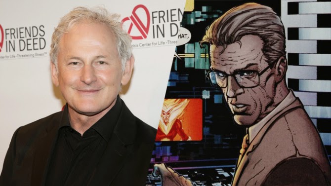
Even if you're not a Firestorm fan, you've probably heard the recent news that Victor Garber is joining the cast of The Flash tv show as Professor Martin Stein, one half of the Firestorm character. News like this always has websites throwing together graphics of the actor next to their comic book counterpart as part of their coverage of the story. I thought we'd have a bit of a look at what people came up with.

The most widely used artwork came from this panel out of Brightest Day #1
Veezo.com went with a generous shot of the comic panel, with Victor Garber a bit squeezed out.
 Variety.com had the same idea, but went for a closer view.
Not to be out-done, comicbook.com cranked the close-up even higher. I've gotta give them bonus points for finding a picture of Victor Garber with a similar pose, rather than just sticking on the first photo they found.
For my money though, the winner when it comes to the use of this panel is comicbookresources.com, who actually spent a bit of time making things look all fancy rather than just pasting two pictures next to each other. Even if it looks like Victor's shoulder is trying to talk.

Next up on the popularity stakes, and the most obvious choice when you want a basic visual explanation of the characters involved, is the cover to the third Firestorm annual.
Wegotthiscovered.com and firestormfan.com both had the same idea.
Starburstmagazine.com took the "Ronnie Raymond who?" route and cropped him out of the picture entirely. OK sure, this is all about the Professor, but that's a bit harsh right?

The "if you only knew how close you were" award goes to tvline.com for this little gem. They got both Firestorm actors in there (nice job!), but gave us "the floating head of Ronnie Raymond" instead of it being the other way around. So close to being (accidental) genius!

Scifi4me.com put in a valiant effort but this looks kinda goofy to be honest. Good idea, good execution, but the wrong Firestorm picture to use for the situation in my humble opinion.

The cover for Firestorm v4 #0 was used quite frequently when Robbie Amell was announced as Ronnie Raymond. Sharetv.com dust it off again for Martin Stein.

Similarly, the variant cover for Brightest Day #2 was used a lot for the Robbie Amell announcement. Here it is from geekynews.com...
 ... and also from deadline.com.
It seems there's a version of this cover with The Atom removed from between Firestorm's hands and replaced by some fancy fire effect. I noticed this when the picture was used for Robbie Amell, but I wasn't sure if it was just a random photoshop one of the news sites had come up with or what. It must be a thing if multiple sites are using it? Here's the original for anyone that's wondering:

TV.com went for the obscure selection with this splash out of Firestorm v3 (the issue number escapes me right now. I know, I know...)
 Thecomicbookcast.com found a nice heroic shot of Firestorm...
 ... while serpentorslair.com went for spooky Firestorm.

To round things out, here's veooz.com with a picture saying "Firestorm who? Isn't this thing called The Flash?". Damn straight.

Wednesday, September 24, 2014

I hope Firestorm Has A Good Lawyer...

...because Dr Fate totally just stole his sound effect.

(Panel from Future's End: Constantine special)

Monday, August 11, 2014

Song Of The Week: Harley Quinn *

Last year saw the release of the debut solo album by Swiss musician Anna Murphy. On it is this catchy little number called "Harley Quinn", a song sung from the perspective of everyone's favourite evil/adorable sidekick.

Anna is already well established in the music world, playing the Hurdy Gurdy and contributing vocals for one of the wold's leading Folk Metal groups, Swiss band Eluveitie.


*this in no way implies I will be updating this blog weekly ;)

Sunday, August 10, 2014

Possibly Not A Great Interrogation Technique

"Princess, please! I do not know anything!"
"You will gaze upon the royal bosom until you tell us the truth!"
"..."
*sound of crickets chirping*

Can't say I'm familiar with the character of Dejah Thoris (beyond the multitude of sketches of her available on eBay), and this doesn't really inspire me to give the book a shot. But hey, maybe I'm wrong and this character is awesome. Judge for yourself with a free preview over on Bleeding Cool of what I'm assuming is the latest trade.

Thursday, January 10, 2013

Song Of The Week: Into The Timewastes

Comic related metal songs are relatively few and far between. The lyric for "Into The Timewastes" by Dutch Death/Doom metal band Asphyx worked it's way into my subconcious after listening to their most recent album ("Deathhammer", 2012) a few times and it eventually hit me - this is totally the A.B.C Warriors, atleast in the start of the song.

"dive into the timewastes
at the speed of light
robot mercenaries
elite for hire
galactic warriors
ancient as space
serving and protecting
a weak organic race
universal empires
face the ultimate threat
disturbance in order
time meets death
sensors activating
defensive shields
encountering chaos
desorientating fields"

That appears to have ties to the Black Hole saga from the late 80's. The ABC Warriors, a band of old war robots, are dispatched into an area known as the Time Wastes to repair a problem that threatens to destroy Earth. Curious, I tracked down an interview with the vocalist to see if it was intentional:
Metal Blast: You guys have always had very interesting song titles; ‘Into The Timewastes,’ ‘Of Days When Blades Turned Blunt,’ ‘We Doom You To Death.’
Martin van Drunen: [Laughs] Yeah, it was just the fun of it. The thing is that we were trying to be original in the song titles, but also so you know what it deals with. ‘Into The Timewastes’ is non-existing, it’s like science fiction more-or-less. That’s what the song says, too. It’s about a bunch of robot mercenaries that travel throughout the galaxy and are constantly at war with all kinds of creatures, and they dive into this thing called the ‘Timewaste’ where time meets death and that is the end of the universe if they don’t fix that problem. That’s the idea behind it; I read too many comics sometimes, I guess.
No confirmation there of the inspiration, but there's a nod to comics at the end so it seems possible.

On to the song itself. It starts off relatively pedestrian - this is your basic straight-ahead Death Metal, and there's nothing subtle about it. Where the song becomes brilliant is at the 1:08 mark, when the breakdown is introduced. Sure it's a couple of simple riffs, but the groove to it is colossal. I defy any metal fan to not nod their head to it.
One of my favourite songs to come out of 2012.

Monday, January 7, 2013

Art In Close-Up: Artist Hijinks

During one of my regular searches for artwork (Firestorm related, of course), I found the cover to Firestorm #2 (vol.2).
Awesome stuff. Upon closer inspection, I noticed this in the margin at the bottom left of the page:
Pat Broderick must've been pretty chuffed with his finished pencils and wanted to see them preserved. Of course these days the penciled art need never leave the artist's side. Back in 1982, I'd imagine it was a much less common (and quite impractical) request.

Raising this from "interesting" to "funny" is a second note to editor Len Wein written in the margin. In the bottom right margin is this response:
I assume this was written by Dick Giordano who was inking the series covers. I like to imagine him seeing the cover and deciding it would actually be quite fun to ink it, and adding this comment in jest.

As it turned out, there was an inked version of the cover done, but what saw print turned out to be markedly different from the original pencils:
I have no idea of the details behind this. As I see it either Pat Broderick drew it again, or Dick Giordano did a recreation of it. I have an inkling that I've seen the inked artwork online once before, but I can't for the life of me find it nor did I appear to save it (which I generally do with all Firestorm artwork I stumble across) so I guess not.

For anyone interested in the cover and with a spare $1,950 to burn, it is currently available here.

Friday, January 4, 2013

Panel Of The Week

This week in Firestorm I noticed something....
...the circle on the back of the costume has finally returned!

It used to be there on the classic costume:
Then it left when Jamal Igle redesigned the outfit in Volume 3:
Brightest Day may've seen the return of Ronnie to the Firestorm costume, but the back circle stayed dead:
Even in a reimagined universe there seemed to be no place for it:
Cool.