JSA All-Stars:
I have no idea who she is, where she came from, or how long she's existed, but I'm very happy to see Anna Fortune continue on with the JSA. Maybe it's the art of Freddie Williams, but she looks damn cool. Having a gun that fires magic bullets doesn't hurt either.
Brightest Day:
So far I'm not that in to the series, although atleast now it seems to be heading somewhere. What caught my eye last issue though, is (predictably, I know) the White Lantern redesign of Firestorm.
That is AWESOME. I would kill to get hold of the original art for that (hell, even just a scan would make me happy), and it's not often I can say that (outside of covers and the like, which we all know you need a ton of money for).
Hercules- Twilight Of A God:
This jumped out at me unexpectedly while browsing the shelves.
Holy crap, is that the Silver Surfer? WTF? That's one hell of a reinvention, and while it's probably someone pretending to be him, it still looks intruiging. I'm being strong willed and holding off reading it until the final issue (#4) is out next month.
Just as an aside, does anyone else recognise this scene from a certain movie?
Yeah, I'm strong willed enough not to read it, but not strong enough to avoid flicking through it.
Iron Man:
These have probably been out for months, but I only just noticed them (it's not like Dr Pepper has a high profile in New Zealand):
In the last week I've managed to track down #s 1, 3, 8, & 9. I have no lofty ambition to collect them all, but they're kinda cool.
Voltron:
My local comic shop never got back to me about getting a copy of the Voltron miniatures game when it appeared in Previews, but the wargaming shop got them in anyway. Score!
Apart from the figures being in need of a repaint (which was expected), the only thing I don't like about this set is the big V's Blazing Sword.
Seems a little more bent than I remember ;) It's fixable, but annoying that I should have to.
Sunday, August 15, 2010
Saturday, August 14, 2010
How Did This Thing Even Look Good On Paper?
There's a new line of Star Wars figures that came out recently (they were embargoed here until August 6th, don't know about the rest of the world). Apart from being some of the best looking Star Wars figures yet, they come with the added feature of being playable in a game. Potentially interesting, lets have a closer look.
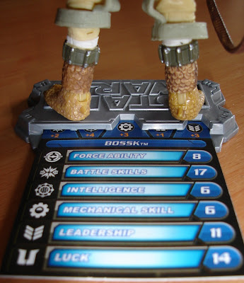
I bought Bossk. He's the best bounty hunter, and I will hear no arguments against him :p
I haven't bought a SW figure in years, but yay for including a stand. Anyway, the game: each figure comes with their own card with a bunch of stats on it.
Also included is this die.
Both players pick figures, then player 1 rolls the die. You take the point value for the corresponding icon rolled, with the highest value winning. The losing figure is discarded.
That's right, the figure you just paid $20NZ for got discarded on the back of a single die roll. If you're player 2, chances are you could lose without even rolling anything for your shiny new toy. Of course, the marketing gurus that came up with this expect you all to have a bunch of figures so you keep playing until last man standing, but any way you look at it this is totally lame.
Monday, August 9, 2010
Spawns Of Future Past
So recently you may've heard about the whole McFarlane/Gaiman Spawn legal carryon. There's been excellent coverage on a blog here. The purpose of this post is to refute a couple of points made by others in the comment section, since I can't post pictures over there. So to begin...
Lambtoons: "The only artwork for Dark Ages Spawn that looked remotely like Medieval Spawn was McFarlane's variant cover to #1 which only showed an extreme close up of the face"
I respectfully disagree, and I'll show you why. Below left, Medieval Spawn as originally presented. On the right a revision of the original design, making it a bit edgier. In the middle, the cover to Dark Ages #1 (regular edition), featuring what is supposed to be a different character.
I've circled some common elements. Now I'll grant you, spiky legs/shoulders/forearms are a feature of your standard Spawn costume. There are two major reasons why I think they are similar enough for one to be derrivative of the other:
1) The face plate. Yes, it's the standard Spawn-type face, but that presented as a metal faceplate to me indicates a connection (no not just on it's own, I mean as a sum of the costume). Are they a bit different? Sure they are. However, to my mind this was merely an evolution in the design, due in large part to a desire to make Dark Ages edgy and, well, dark. If you look at the changes in the way Al Simmons Spawn has been presented over the years, his design underwent many changes, as did the mood of the comic. With the evolution of various titles like "Hellspawn", "Curse of the Spawn", "Spawn the undead" etc which significantly increased the dark atmosphere of the original concept, I do not believe it is a big stretch to look at the middle picture and think something along the lines of "damn, they just made Medieval Spawn look a whole lot tougher".
2) The chest design. This is the standard design for spawns also. However, where I see the similarity is this- the blue armour, white edging, and red centre. 99% of other spawns we've seen have black clothing. In this case, we have two characters. Both presented as knights. Both from seemingly similar time periods (semantics aside). Both in BLUE armour, with white and red markings.
It's my contention that the above two elements, when combined with each other, and when taken in the larger context of the overall presentation of the suit, are similar. Which is where the problem lies. As someone who collected Spawn for over 10 years or so (including a ton of cards and toys), Dark Ages at the time, and still now, looks to me like merely a grittier update of the Medieval Spawn armour.
Also worth noting, the Dark Ages Spawn costume evolved quite rapidly in the course of the comic, to where, if memory serves, it looked quite different. However, the above costume from issue #1 was also used on the cover of issue #2. Whatever evolution took place, I believe it's initial presentation was close to that of Medieval Spawn. Which is what the court case was about- is DAspawn derivative of Mspawn. In his first few appearances (atleast visually, I'm not inclined to re-read the series, if I even still have it), the answer has to be yes, in my opinion. A character will develop his own feel over time, but in his initial presentation, I see Medieval Spawn, not a distinctly different character.
Lambtoons: "No one who collected the series and read it was given the wrong impression that they were selling Medieval Spawn repackaged"
I'd actually argue that's exactly what they were doing, atleast at the start. It makes commercial sense- package something in a way that's recognisable. Medieval Spawn was a popular character despite (or perhaps thanks to) only appearing in 3 (?) issues. To make a new product instantly entice readers, having him look similar makes total sense. Once people step through the door, then you can turn the tables on them and present your ideas. Certainly all the publicity leading up to the first issue, as I remember it, did little to dispell the idea that it was Medieval Spawn. Now, once the series got going, maybe it quickly became apparent it was a different character (I don't remember). But in the initial stages, I stand by my assertion.
Just in closing, I'd like to make clear this is not a pro-Gaiman/anti-McFarlane thing on my part, I just happen to agree with the Judge's ruling. I've read maybe a half dozen comics by Gaiman post-Sandman. I still have a strong affection for Al Simmons, despite having walked away from Spawn several years ago (I'm about to start binding my Spawn collection, and considering picking up all the missing issues just to complete the Al Simmons story). Just thought I'd throw that out there, since experience teaches these things can easily become about which side you're on. I'm on the side of good comics.
Sunday, August 1, 2010
Subscribe to:
Posts (Atom)